You're probably building reports the way most SEOs start. A GA4 screenshot here, a Search Console export there, a rank tracker tab open in the background, and a client call where you spend half the meeting explaining what they're looking at.
That's usually the moment a seo client dashboard stops being a “nice to have” and becomes a core part of delivery.
A bad dashboard is just a tidier spreadsheet. A good one does three jobs at once. It shows performance, explains why performance changed, and gives the client a reason to trust your recommendations. When that part is missing, even solid SEO work can feel vague.
I've seen junior teams make the same mistake over and over. They try to prove effort by showing everything. More charts. More exports. More tabs. The result is confusion, not confidence. If you want a useful model for the mindset behind reporting, read this piece on effective data execution for growth teams. The point applies directly to SEO reporting. Data only helps when someone can act on it.
The dashboard that wins client trust isn't the one with the most widgets. It's the one that answers the client's actual question fast: Are we becoming more visible, attracting the right audience, and turning that attention into business results?
From Data Dumps to Actionable Insights
The most common reporting failure isn't bad data. It's bad translation.
Clients don't buy SEO because they want to stare at impressions, average position, and engagement graphs. They buy SEO because they want growth. That might mean sales, leads, listeners, subscribers, readers, or audience reach across a content library. Your dashboard has to connect the SEO work to that outcome.
What weak reporting looks like
A weak seo client dashboard usually has one of these problems:
- Too much surface area. Every metric available gets pulled in, whether or not it helps a decision.
- No business framing. Rankings go up, but the dashboard never shows whether qualified traffic or conversions improved.
- No context. A line moved. Nobody explains why.
- No prioritization. The client can't tell what matters now versus what's just background noise.
A client shouldn't have to ask, “What am I supposed to take from this?” Your dashboard should answer that before they speak.
This matters even more for creators, publishers, and media brands. Those clients often have large libraries of old articles, episodes, videos, or guides. If your reporting only focuses on current-month traffic and a handful of keywords, you're missing the larger story of how search can revive and monetize existing assets.
What useful reporting does instead
A strong dashboard narrows the field. It tells a sequence the client can follow:
- Visibility is improving or slipping.
- Traffic quality is changing in a meaningful way.
- Conversions or audience actions reflect that change.
- Next actions are clear.
That's the shift from data dump to operational tool. Once you build around that idea, every chart has a job. Every metric earns its place. And your monthly review stops sounding like a live audit of disconnected numbers.
First, Align Your Dashboard with Business Goals
Before you pick a chart type or connector, decide what the dashboard is supposed to prove.
Instead of starting with tools, many agencies first ask whether they should use Looker Studio, Whatagraph, or AgencyAnalytics. That's backwards. Start with the client's business objective, then work down to the supporting SEO indicators.
Enterprise dashboards are often built as a hierarchy across SEO Health, Engagement Signals, a Connection Layer for prioritization, Conversion Metrics, and Technical Performance, with a warning against dashboard bloat from vanity metrics that don't drive decisions, as noted by Siteimprove's dashboard framework.

Use a KPI ladder, not a metric pile
Think of your seo client dashboard as a ladder.
At the bottom are the inputs and constraints. Can search engines crawl the site? Are important pages indexed? Are there technical issues getting in the way? In the middle are visibility and engagement signals. At the top are conversions, leads, revenue, or audience actions.
If you skip the ladder and jump straight to top-line outcomes, your reporting gets brittle. A drop in conversions appears with no explanation. A rise in impressions looks meaningless. The client sees motion but not causation.
Map goals to metrics
Different clients need different versions of the same ladder.
Consider this practical approach:
| Business goal | What the dashboard should emphasize | What to avoid |
|---|---|---|
| Sales and revenue | Organic-driven revenue, goal completions, conversion rate | Ranking charts with no revenue context |
| Lead generation | Form submissions, phone calls, organic traffic volume | Generic traffic summaries with no lead actions |
| Publisher or media growth | Organic traffic, impressions, CTR, top pages, content engagement | Technical charts with no editorial meaning |
| Content library monetization | Evergreen performance, decaying pages, archive opportunities | Only reporting on newly published content |
The critical move is tying every lower-level metric to something higher up the ladder.
For example, a crawl issue matters because it affects indexation. Indexation matters because it affects rankings. Rankings matter because they influence traffic. Traffic matters because it can create leads, purchases, or audience growth. If a metric can't be connected to that chain, it probably doesn't belong on the client-facing view.
Ask better kickoff questions
Don't open with “Which KPIs do you want?”
Most clients don't know. Ask questions that force business context:
- What outcome matters most this quarter. Sales, leads, subscriptions, downloads, booked calls, or audience growth?
- Which pages or content types matter most. Product pages, articles, category pages, podcast episodes, video pages?
- What would make the dashboard feel useful to your team. Fast updates, executive summaries, page-level insights, issue alerts?
- Who will read this. Founder, marketing lead, editor, producer, or board-facing stakeholder?
Practical rule: Build the dashboard for the decision-maker first. Build drill-down views for practitioners second.
That keeps the first screen focused. Most clients should land on a compact summary that answers business questions quickly, not a wall of SEO diagnostics.
Separate executive view from working view
One mistake I push teams to avoid is putting everything on one page.
Use at least two layers:
- Client summary view with the handful of metrics tied to goals
- Working analyst view with technical, page-level, and troubleshooting detail
The client summary should feel calm. It's not where you show every redirect issue or query-level edge case. That detail belongs in the operational layer your team uses to investigate and optimize.
A dashboard earns trust when it reflects the client's priorities, not the SEO team's toolset.
Choosing the KPIs That Actually Matter
The best seo client dashboard usually stays narrow. The top position in Google captures 39.8% of click-through rate, which is why rankings matter, but experts still recommend limiting dashboards to 5 to 9 essential metrics so clients don't get overwhelmed, according to Metrics Watch's SEO dashboard guidance.
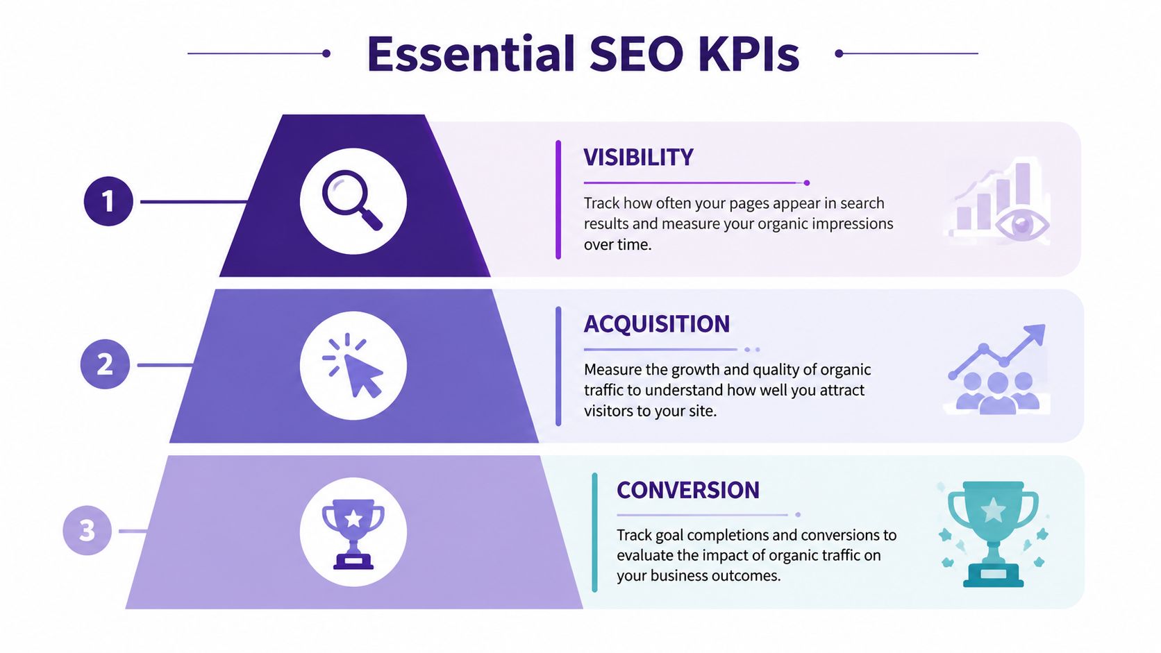
Visibility metrics that explain search presence
Start with the metrics that show whether the site is appearing where it should.
- Impressions tell you how often the site appears in results. This is often the earliest sign that coverage, relevance, or content targeting is improving.
- Average rank helps you judge where that visibility sits. It's especially useful when segmented by page group, keyword theme, or intent.
- Keyword rankings for priority terms belong on the dashboard when they represent real business value, not vanity wins.
A common pitfall is treating visibility changes as success on their own. More impressions can be good, but only if they're tied to useful queries and useful pages.
For content-heavy brands, segment visibility by content bucket. Don't lump blog posts, videos, evergreen guides, and commercial pages into one undifferentiated trendline.
Engagement metrics that reveal search quality
Traffic without interaction is weak evidence.
Use a small set of engagement indicators to show whether searchers are finding what they expected after clicking.
- Organic CTR is one of the best bridges between rankings and traffic. It often exposes weak titles and meta descriptions faster than traffic summaries do.
- Engaged sessions help you separate accidental visits from meaningful ones.
- Pages per session, bounce rate, or dwell-oriented engagement signals can support the story, but only when they're attached to important page groups.
If you want a practical content-side lens for interpreting these patterns, this guide on analyzing content performance is useful because it pushes you to evaluate pages as assets, not just URLs.
If impressions are rising and CTR is flat or falling, don't panic automatically. First check whether the site is gaining exposure for broader, earlier-stage, or long-tail queries.
That interpretation matters. Junior analysts often report a CTR dip as a failure when it may instead reflect expanded reach.
Conversion metrics that prove value
The dashboard either becomes credible or stays cosmetic.
For most client-facing dashboards, the most important metrics are:
- Goal completions from organic traffic
- Conversion rate from organic
- Organic-driven revenue, where available
- Lead actions such as form submissions or calls for lead-gen businesses
A simple way to frame the three KPI groups is below:
| KPI group | Core question | Best use |
|---|---|---|
| Visibility | Are we showing up more often and in better positions? | Search presence and early momentum |
| Engagement | Are searchers choosing and using our pages? | Snippet quality and page relevance |
| Conversions | Is organic search contributing to business outcomes? | ROI and retention conversations |
The story becomes much stronger when you show trends over months instead of isolated weekly snapshots. A dashboard should make direction obvious. A one-week spike rarely means much by itself.
Connecting Data and Building Your Dashboard
Once the KPI logic is solid, you can build the machinery underneath it.
Most seo client dashboard setups rely on a combination of Google Analytics 4, Google Search Console, and at least one outside tool for rank tracking, backlink visibility, or technical monitoring. GA4 helps you see user behavior and conversions. Search Console gives you query, click, impression, and average position data. External tools fill gaps around rankings, site audits, and backlink reporting.

Know what each platform is good at
GA4 and GSC are not interchangeable. Treating them as if they should match line for line creates reporting drama you don't need.
Use them this way:
- GSC for search visibility. Queries, impressions, clicks, CTR, and average rank.
- GA4 for on-site behavior. Sessions, engaged sessions, conversion events, and path analysis.
- CRM or sales system for executive truth. Qualified leads, validated revenue, and final business outcomes.
- Rank tracker and crawler for operational insight. Priority keyword movement, site issues, and technical regressions.
This layered approach becomes essential because 58.5% of Google searches now end in zero clicks, rising to 74% when AI Overviews appear, and 47% of marketers report major discrepancies between platform-reported conversions and actual conversions, according to Improvado's SEO analytics guide.
Reconcile before you report
If your GA4 conversion count and CRM lead count don't match, don't hide that. Explain the hierarchy.
A practical reporting protocol looks like this:
- Use GSC for search exposure
- Use GA4 for optimization clues
- Use CRM data for business reporting
- Annotate any known mismatch so clients aren't surprised
That keeps the dashboard honest. It also stops you from over-reporting wins that sales teams can't verify.
Working rule: Let GA4 help you optimize. Let the CRM help you report to leadership.
This is especially important when the client asks for ROI forecasting. For directional planning, a simple tool for forecasting content marketing profitability can help frame assumptions before you turn them into dashboard targets.
Pick the right dashboard tool for the job
Your platform choice should match the client's needs and your team's tolerance for maintenance.
| Tool | Best for | Trade-off |
|---|---|---|
| Looker Studio | Flexible custom builds and low software cost | More setup, more maintenance |
| AgencyAnalytics | Agency reporting workflows and client access | Less flexible than a custom BI setup |
| Whatagraph | Fast presentation-ready dashboards | Can feel templated if overused |
If you're trying to reduce manual reporting work, it also helps to think in terms of systems, not just visuals. This overview of an SEO automation platform is a useful reminder that reporting quality often depends on upstream workflow quality.
A short walkthrough can help if you're building from scratch and want to see common setup patterns in action.
Build in layers, not all at once
Don't try to perfect the final dashboard in one pass.
Build it in this order:
- First layer. Business summary with the few KPIs the client cares about most
- Second layer. Supporting visibility and engagement views
- Third layer. Technical and investigative tabs for your team
That sequence protects clarity. It also makes QA easier, because you can validate the metric spine before adding filters, breakdowns, and drill-down detail.
Designing for Clarity and Client Communication
A dashboard can be technically accurate and still fail.
The failure point is usually interpretation. Clients don't live inside GA4, Search Console, and rank trackers all day. If the dashboard assumes they do, they'll either ignore it or misread it. That's expensive. A 2025 AgencyAnalytics survey found 58% of client churn is attributed to metric confusion, and the same source says agencies are using narrative flows and KPI glossaries to improve retention, as described in AgencyAnalytics' guidance on building SEO dashboards for clients.

Build a narrative flow
A good client dashboard should read top to bottom like a conversation.
Start with the result the client cares about most. Then show the supporting reasons underneath. That often means:
- Top summary cards for conversions, leads, or revenue-related outcomes
- Visibility section for impressions, clicks, and ranking movement
- Page or content section showing winners, decliners, and opportunities
- Notes and actions explaining what changed and what happens next
That order matters. If the first thing a client sees is a technical chart, they'll often anchor on the wrong issue.
Use plain-language scaffolding
Most dashboards need a small education layer built in.
That can include:
- KPI glossaries in side panels or hover text
- Short chart subtitles that explain what the user is seeing
- Annotations that explain spikes, dips, migrations, or content releases
- Callout boxes that summarize why a change matters
For example, don't label a chart “CTR by query cohort.” Label it something like “How often searchers clicked when our pages appeared.” The latter is easier to process and doesn't water down the meaning.
The client should never need a second screen open just to decode your dashboard labels.
Choose visuals that reduce friction
Here's a practical matching guide:
| Dashboard need | Best chart choice | Why it works |
|---|---|---|
| Trend over time | Line chart | Clients can see direction quickly |
| Top pages or top queries | Bar chart or compact table | Easy ranking and comparison |
| KPI summary | Scorecards | Good for fast scanning |
| Performance explanation | Annotation or note box | Adds context numbers can't provide |
Avoid decorative complexity. Gauges, overdesigned score dials, and dense heatmaps often look impressive but slow comprehension.
Add commentary where trust is won
A client dashboard should include written interpretation, not just visualization.
Good annotations answer questions like:
- Why did traffic drop this month?
- Was the ranking loss tied to a technical issue, seasonality, or content competition?
- Did impressions rise because coverage broadened, even if average rank softened?
- Which pages need work next?
That commentary is where your expertise becomes visible. Otherwise, the dashboard looks like a machine-generated report the client could have assembled without you.
Automating Reports and Unlocking AI Insights
The end goal isn't just a cleaner report. It's a reporting system that frees your team to analyze, prioritize, and act.
Automation handles the routine part. Schedule refreshes. Set up email delivery for executive summaries if the client wants snapshots. Keep a live link for the people who prefer real-time access. The less time your team spends exporting and formatting, the more time you can spend diagnosing what changed.
Automate the repeatable parts
The parts worth automating are usually straightforward:
- Data refresh schedules so dashboards don't depend on manual exports
- Client delivery cadence with monthly snapshots or recurring access
- Alerts for major regressions so your team sees drops early
- Standardized dashboard templates for clients with similar reporting needs
The trap is automating noise. If the dashboard is cluttered or poorly structured, sending it faster doesn't improve anything. It just distributes confusion more efficiently.
Add a historical content layer
Many SEO dashboards still fall short in this regard, especially for creators, publishers, podcasters, and media brands.
According to Userp's analysis of SEO client dashboard gaps, content organizations hold 70 to 80% of their value in untapped archives, yet most dashboards still ignore historical content performance. That's why AI-assisted archive analysis is becoming so useful. It helps teams surface content decay curves, identify repurposing opportunities, and report on repurposed content uplift without treating the archive like dead weight.
That changes how you build the dashboard.
Instead of only reporting on current winners, start adding views such as:
- Evergreen content trendlines for older posts, episodes, or videos
- Decay monitoring for once-strong assets that are slipping
- Repurposing candidates based on topic relevance and historical traction
- Archive clusters that reveal underused themes across past content
For teams exploring this direction, this overview of AI for SEO is useful because it frames AI as a workflow layer for discovery and prioritization, not just a writing shortcut.
Old content isn't dead inventory. In many organizations, it's the biggest unrealized SEO asset in the building.
Turn reporting into planning
Once you add automation and archive intelligence, the seo client dashboard stops being a backward-looking scorecard.
It becomes a planning surface.
That's the version clients remember. Not because it had more charts, but because it helped them see what to update, what to expand, what to repurpose, and where the next search gains are likely to come from.
If your team wants to turn old articles, podcasts, videos, and research assets into searchable, reusable growth opportunities, Contesimal helps organize historical libraries, uncover hidden themes, and surface new value from content you've already created. It's built for content organizations that want better collaboration, stronger research workflows, and more ways to make their archives work harder.